opinions
- Thread starter angie j
- Start date
charlieinnj
New member
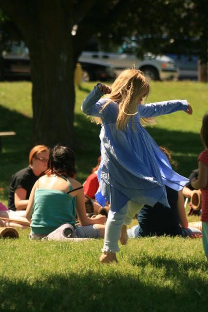
Number 1
Emma & Nigel's Mom
New member
I like the how the sun warms up the whole picture in #1, she has such pretty golden hair.
Garden_girl
New member
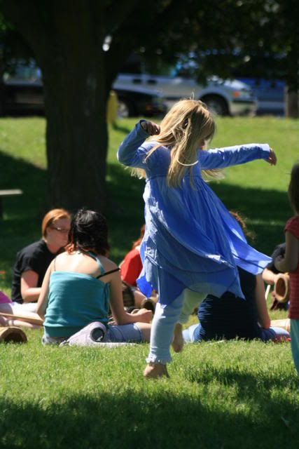
I'm probably going to be the only one, but I like #2 better. ")
If I were looking at this scene 'for real', I imagine myself squinting from the sunlight looking at #1. The colors ar softer in #2. #1 actually looks darker to me because of the contrast in light and color saturation.
If I were looking at this scene 'for real', I imagine myself squinting from the sunlight looking at #1. The colors ar softer in #2. #1 actually looks darker to me because of the contrast in light and color saturation.
Lithian
New member
I thought #2 looked more true so i pulled them up in potatoshop to have a look and ended up playing around...

basic goal was to bring as much focus to the girl in the blue as i could so i tried to make it look like there was a big white wall just off camera right bouncing the sunlight back, I also darkened the cars in the background. Its a bit of a quickie and wouldn't pass muster at print scale because of the grainyness from bumping the brightness so much... but i need the practice.
basic goal was to bring as much focus to the girl in the blue as i could so i tried to make it look like there was a big white wall just off camera right bouncing the sunlight back, I also darkened the cars in the background. Its a bit of a quickie and wouldn't pass muster at print scale because of the grainyness from bumping the brightness so much... but i need the practice.
tonkatruck
Active member
#1 :kgo_027:
sarnewfie
New member
i liked the top ones better than the photoshop one, the top ones are much clearer, the girl however does not quite stand out as much as she could if it were cropped down some. #2 is also the one i prefer.
for some reason my eye is drawn to the darkness at the top part of the photo.
nice job!
for some reason my eye is drawn to the darkness at the top part of the photo.
nice job!
angie j
New member
Thanks everyone!
I also prefer #2.... but I presummed that I would be unique there, glad I'm not alone...
I like the darks for some reason.
But I did like #1 also, for the same reasons stated: summery, and bright!
I didn't want to crop it down because I wanted to capture the 'moment' as well as the ballerina There were drummers in the park that day and she was the 'belle of the ball'... Perfect for a self centred 5 yr old..lol.
Angie J
I also prefer #2.... but I presummed that I would be unique there, glad I'm not alone...
I like the darks for some reason.
But I did like #1 also, for the same reasons stated: summery, and bright!
I didn't want to crop it down because I wanted to capture the 'moment' as well as the ballerina
There were drummers in the park that day and she was the 'belle of the ball'... Perfect for a self centred 5 yr old..lol.Angie J